The Art Project
I, much like most people, found myself absolutely bored throughout the year of 2020. As a result, much like those people, I found myself a hobby. 10 guesses what that was. That's right! I practiced the yo-yo. On the side I also did a small thing called drawing portraits. Needless to say; that was fun. Also, it was very, very bad. As a result, feel free to click through a year's worth of drawing and see myself get slightly better. In addition to that, feel free to read my notes on them all.
.webp)
Leonardo Dicaprio
.webp)
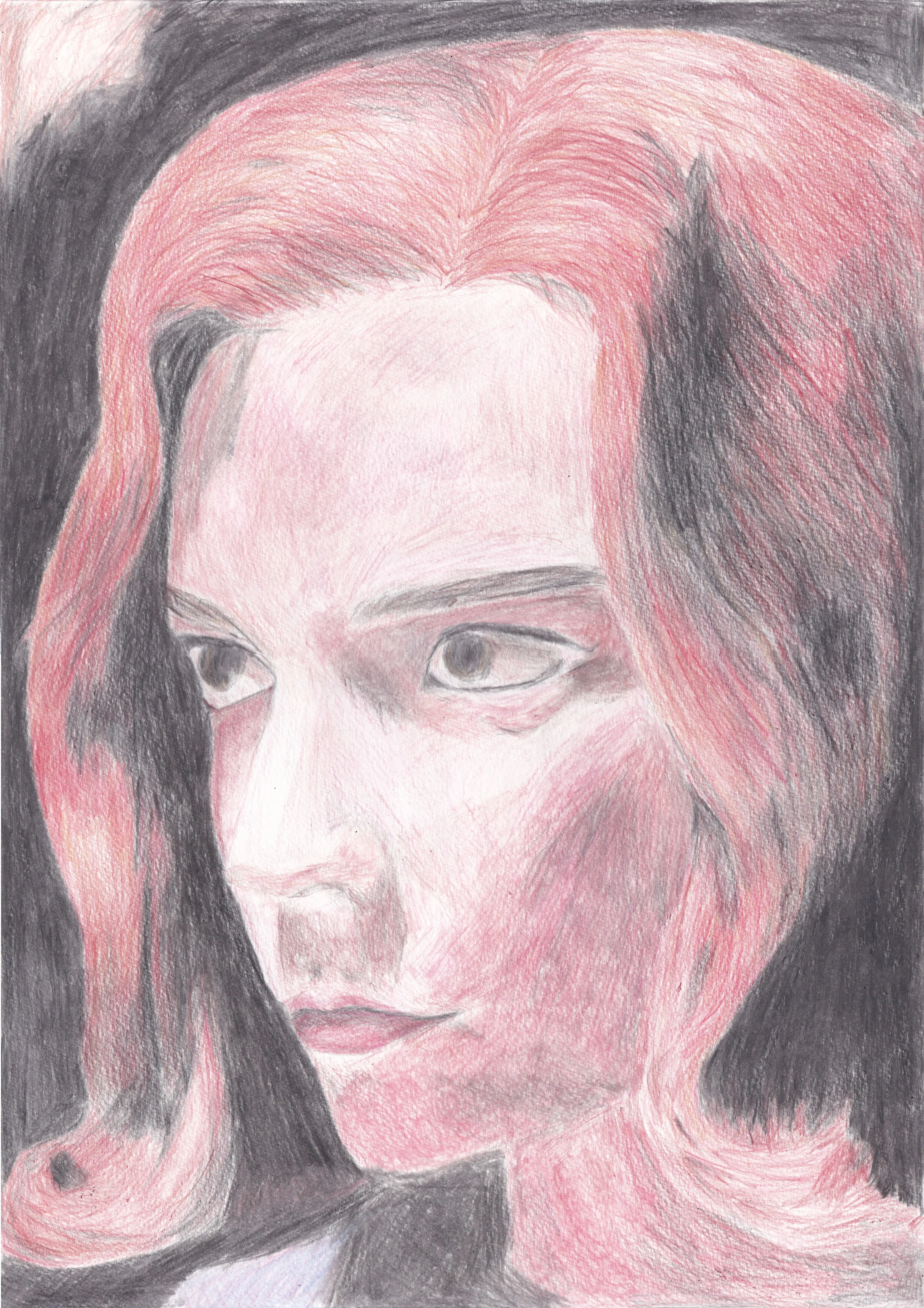
So the first of the train. Pretty much testing the waters for art. Eyes are clearly a strong suit; everything else needs work My general learning background was the basic 'working by halves' technique. Here was my first time using grids (I use dots since lines come easy for me to visualise). Anyway. First lesson, hair is spaghetti like. I should have mimicked the density I used on the side for the foreground. Also, blending is a big issue.
John Constantine
.webp)
I was just testing out Staedtler pencils. Basically got lazy and tried to do things quickly. Clearly patience is key.
Joker
.webp)
Woah Woah Woah; clearly I'm going to fast. Still has a bit of spaghetti hair. This angle and detail level is just too much for someone with too little experience
Joker
.webp)
This is much better. Still has Spaghetti hair but has shading in the background so none of the white shines through. Proportions are slightly off. Clearly I'm failing on hair on all accounts of colour, proportion and shape; I should do more
River Song
.webp)
Hair has finally been textured. Shading was a huge let down. I should have payed further attention to the reference.
Murph
.webp)
Hair technique is on point now, now I need to refine it. Skin tones are clearly a problem but clothes seem to be working well. Lips need a bit of refinement too
Mr Micawber
.webp)
Better texture and shading. Teeth needs work and details need to be improved upon by a large degree. I might procrastinate on teeth for now :p.
Cooper
.webp)
Proportions and expression with a touch of shading needs to be improved for my pieces
Ra's Al Ghul
.webp)
Pretty good proportions and texturing. Sketchy look needs to change and the outline looks too square and straight; I need to work on better shaping
Ariadne
.webp)
Much better. Only real issue here is the skin; looks too tanned. Take liberties with the reference; if I know that I'm not ready for warmer lighting, don't go crazy with the orange pencil on the face
Vampire Batman (yes this was named afterwards)
.webp)
Easily the worst of the lot. It was a wake up call that I need to have a better understanding of colour so I could implement shades much better. Giving up and then scribbling the skin tones in at the end didn't help either. But I do want to point out that it's OK to point out a lost cause and move on if you're not getting anywhere
Missy
.webp)
I'm really happy with the hat; colour was well done but still issues with shading and texture. Scratchiness has been reduced but layering needs to be implemented (not that I knew that at the time)
Roderick
.webp)
Basic shape and ideas conveyed to give a realistic image. Weird
Constantine
.webp)
A bit sketchy and squarish.
Clark Kent
.webp)
I didn't really appreciate this piece at the time but it really is the best I've done until that point. The tonal range is much more improved, and the hair well textured. The only nit-picks is the issue with texturing his shirt and the relative proportion on the eyes
Lois Lane
.webp)
If your detail isn't good enough, choose a frame that makes it obvious that one thing is a collar and the other the shoulder. Contour with a dark pencil and colour at the same time. Doing the latter first can end making it too powerful. I have no idea where to begin with highlights as big as the one in the reference:
The Endless
.webp)
At the time I logged it (since it was my first non-photorealistic project and major project
(all projects prior I rushed in under an hour; this was done in a week):
So this is a stitched scan, so you may notice a line across the centre. Let's begin:
- Death. So I went for realism, didn't realise that it's near impossible to create realism
from scratch even for the best of artists so 0_o my disappointment was immense. The umbrella
did light up my face. I kept her hands covered up to make it easier.
- Dream: This should be eas- never mind. I'll come back later
- Destiny: Not too troublesome. I looked up assassin creed fan art tutorials to learn how to
make a hood. Though I made the mistake of putting the sigil at the light end as opposed to
the dark end, which led to a domino effect of almost all of them being difficult to spot
- Destruction: Easy enough to draw. Based the body off Smallville Clark Kent. The head looks
awful with that beard outline; might have to come back to it
- Dream (again): Head seems fine. I can use that meme hand drawing for it. Used the locus of
the wrist and the shoulder to place the elbow. The hair seems tricky. I just winged it with
spikes; seems decent enough. At this point it's clear that the black colouring pencil does
not compare to a normal pencil
- Despair: Pretty easy. I'm used to heads and the eye is the easiest bit. Though the realism
of the tear of the eye in relation to the lack of realism in the face makes the tear easy to
miss.
- Desire: I couldn't think of a pose. Then I searched it up and pretty much ctrl C ctrl V
the image it was that good. It could be considered cheating since I never used a direct ref
for the others nor have I used artwork in itself as a direct ref at all but meh.
- Destruction (again): I just braved the colouring since getting a usable face to begin with
took hours. Turns out that the beard outline was quite deceptive and the end product was not
that bad
- Delirium: Hardest for last ig. The body wasn't too bad to make. The too big jacket was an
artistic choice btw, but I really failed to show gravity's effect on the clothing (I tried
making the jacket sort of fold but it doesn't seem natural). But it turned out alrightish
for the colouring. Though I must say; leather is a pain to colour, especially black leather.
Moving on: Definitely need to stop relying on blur to cover up screwups in detail, and I
really need to get more saturation from my pencils, even if they're not that good.
Eye
.webp)
Mostly inspired from Jono Dry's eye. I was curious how much better I can draw if the detail is magnified. Interestingly quite a lot, but it makes skin 10 times harder to do
Elaine Belloc
.webp)
Another non-reference non-realism art work for a competition online. I need to improve my knowledge on the human figure. My heart wasn't really in it so it was admittedly rushed
Joker
.webp)
Right then. At face value it's decent; I was quite pleased with the waistcoat. I thought this frame would mean less need of skin tones (I only have one pencil per skin tone (orange and pink on top lightly helps but isn't as realistic). It did work, but the problem was that the reference was highly saturated; I couldn't quite reach the level of saturation required; you can see on the coat I pressed as hard as I could to reach a red. Though I do think I could have done more to adjust to low depth of colour.
Hermione Granger
.webp)
Okay now I have a Faber Castell set of 24 as a gift. Now I need to utilise layers in order to create a better degree of realism. Skin tones have finally improved. The main issue is clothing; I need to make it more photorealistic
The Joker
A remake of my failed attempt from before. I decided to take the reference and make the hair greener on photoshop. I upped the contrast too. There aren't any glaring issues. By this point, I'm pretty satisfied with my art, but I want to see if it's possible to meet photorealistic standards and perhaps hyperrealism. The main issue with this piece is that it was too easy; the contrast really reduced detail meaning that it was mostly just a case of getting a good sketch done and colour by number. Side note; first time with zest-it; only works on thick paper (but I used it with the lips for this piece).
Harley Quinn Joker Line-up
.webp)
A sort of cartoon I did for another online competition. Cartoon really isn't my style, but I still want to work on it :p
Gaiman and Hadley
.webp)
So I swapped out the Joker for this in an art competition. I think that Gaiman (right) was
well done (the hair felt natural and the shading really achieved that texture), though the
space between the nose and the mouth needs to be better detailed; it looks too flat. Hadley
(left) was harder to do as her reference was poorer and I had never added fake features on a
photorealistic drawing before; the hair down the side of the nose (actually someone else in
the reference), the eyeliner and the necklace, The shading was alright but the Drawing just
looks too simplistic to see real.
This is my first time using B-8B (I've always used HB) and this is probably the most
educational piece I've made
Wonder Woman
.webp)
First A4 piece here. I did the whole thing in HB.
So I thought I'd touch it up with a 2B after then maybe bump up to 6 then 8...
I did not do that.
I did minor tweaks with a 2B before getting bored and going in straight with the 8B before
going for mid-tones with 4, using the B to repronounce shape at a few places. Lazy, sloppy
and scratchy, but it got the job done :)
John Constantine
.webp)
I honestly wanted to cry when I saw how this came out; reminder to always use a mirror whilst working. The proportions are all wrong, but at least the skin tone is better. Maybe one day I will give this another go.
The 10th Doctor
.webp)
This is a lot better. The proportions, are correct, and the textures are fairly decent. I just need to blend more and create stronger contrast (I know the gamma is off on this image but even then it still needs work).
Sally Sparrow
.webp)
The colour is well rendered here, and the texture isn't half bad, but the proportion on the eyes need work. All the more reason I should start using a mirror more frequently.
Abed Nadir
.webp)
I need to blend better, but I think I have the lighting down. I also need to improve texture on the clothing.
Beth Harmon
This is interesting, because the lighting isn't as vividly red as it is in the picture; perhaps I got lucky. Either way I would love to try this out again.
Bloodsport
.webp)
I finally plucked up the courage to try darker skin tones; it honestly went better than I expected, and I think I will try more to make it easier (and better for practice) to render skin tones if I stick to darker skin tones, because I can get more lead on paper.